The makeover of the second-handed
This is a project I did with a team for the Craigslist website. We made the UX process and the redesign. Craigslist became a mobile app that was modern and according to the users needs.
Role
UX Designer

This is a project I did with a team for the Craigslist website. We made the UX process and the redesign. Craigslist became a mobile app that was modern and according to the users needs.
UX Designer
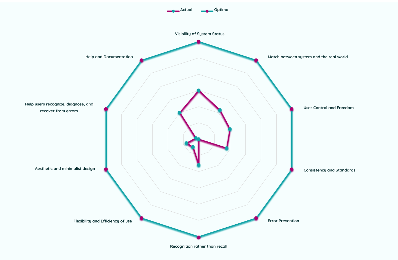
We started inspecting the usability of Craigslist, with the heuristic evaluation. We found out that the principal error is that most of the objects don’t have a logical hierarchy. Also, it has a lot of elements that make the user think more, it looks saturated and for that reason it’s confusing.
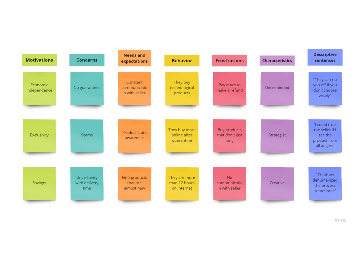
We made six interviews with people that liked to buy second handed products online. We needed to understand their mental models and their perspectives or motivations.
Then they let us know that communication was the key for them to decide whether to buy or not.
Another insight was that they appreciate multimedia files (videos, gifs...) of the products where they can see it in detail and be more confident with the sale.
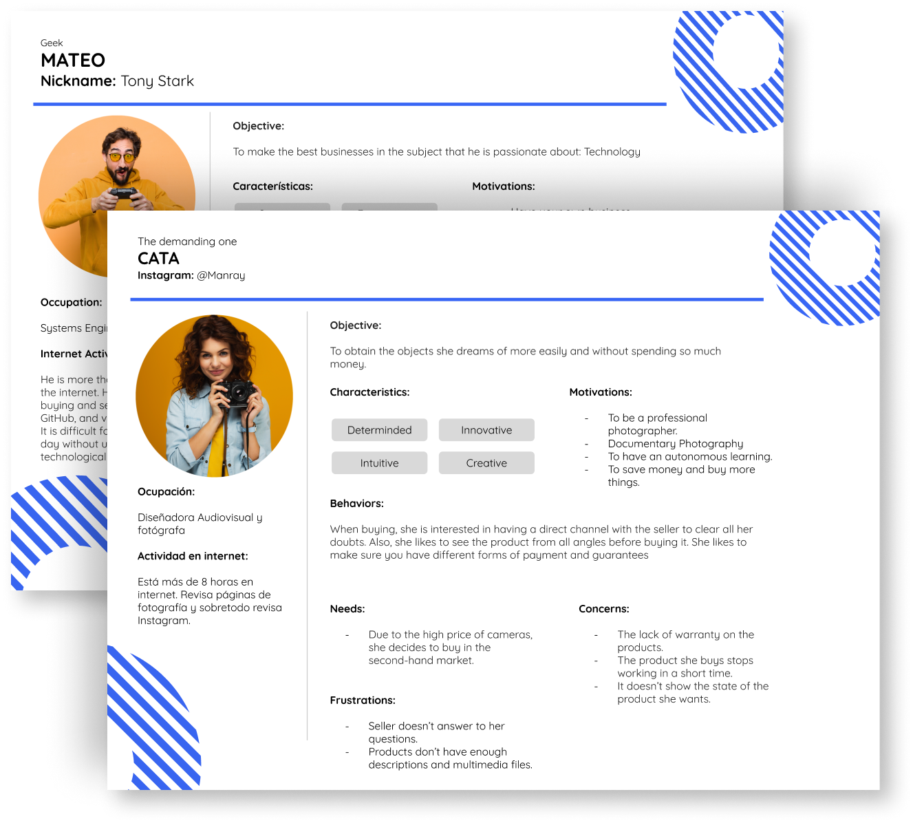
According to these interviews, we created two personas.
The first one, called Mateo, is a man who is very passionate about technology. He is an entrepreneur who likes to collect or resell technological objects. He needs to make sure the product is the same that the seller shows and it has the best price for him.
The second persona is Cata, a woman that is very artistic and creative. She likes to buy second handed products to use in her job and to increase her abilities and knowledge. She likes to get in touch with the seller so she can get a guarantee of the product state. She also likes to make sure all the comments are good enough to make the sale.
.gif)
To ideate our solution, we made a content briefing to summarize our objectives, our target, our promises, and the users' paint points and moods.
We also created the content prototype to visualize what the interaction would be between users and the app according to our discovery.
Finally, we made the user flow, from the home section until the confirmation of the sale. For practice purposes, we only made the happy pat.
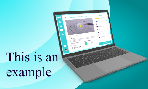
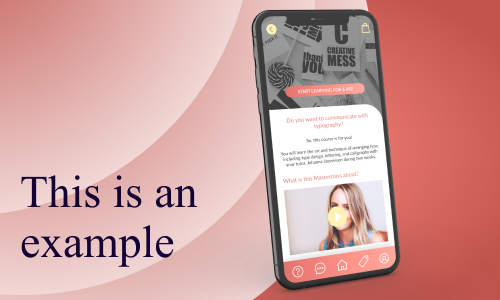
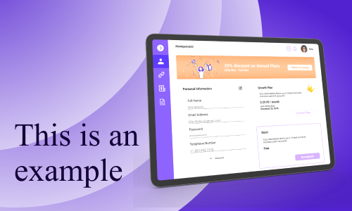
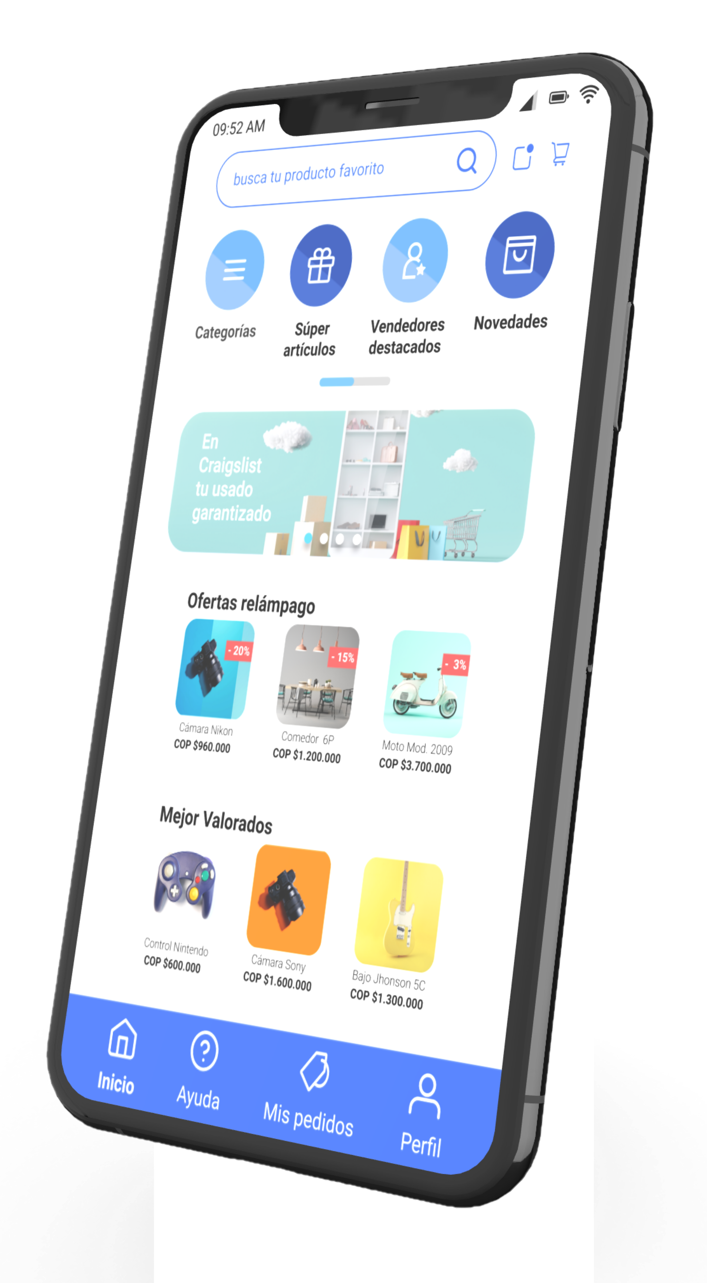
It was time to start sketching. We decided to make a mobile app because most of our users tend to use more their cellphones.
Then we made the low-fidelity sketches with Miro. With Figma, we created the style guide (colors, type fonts, grids…).
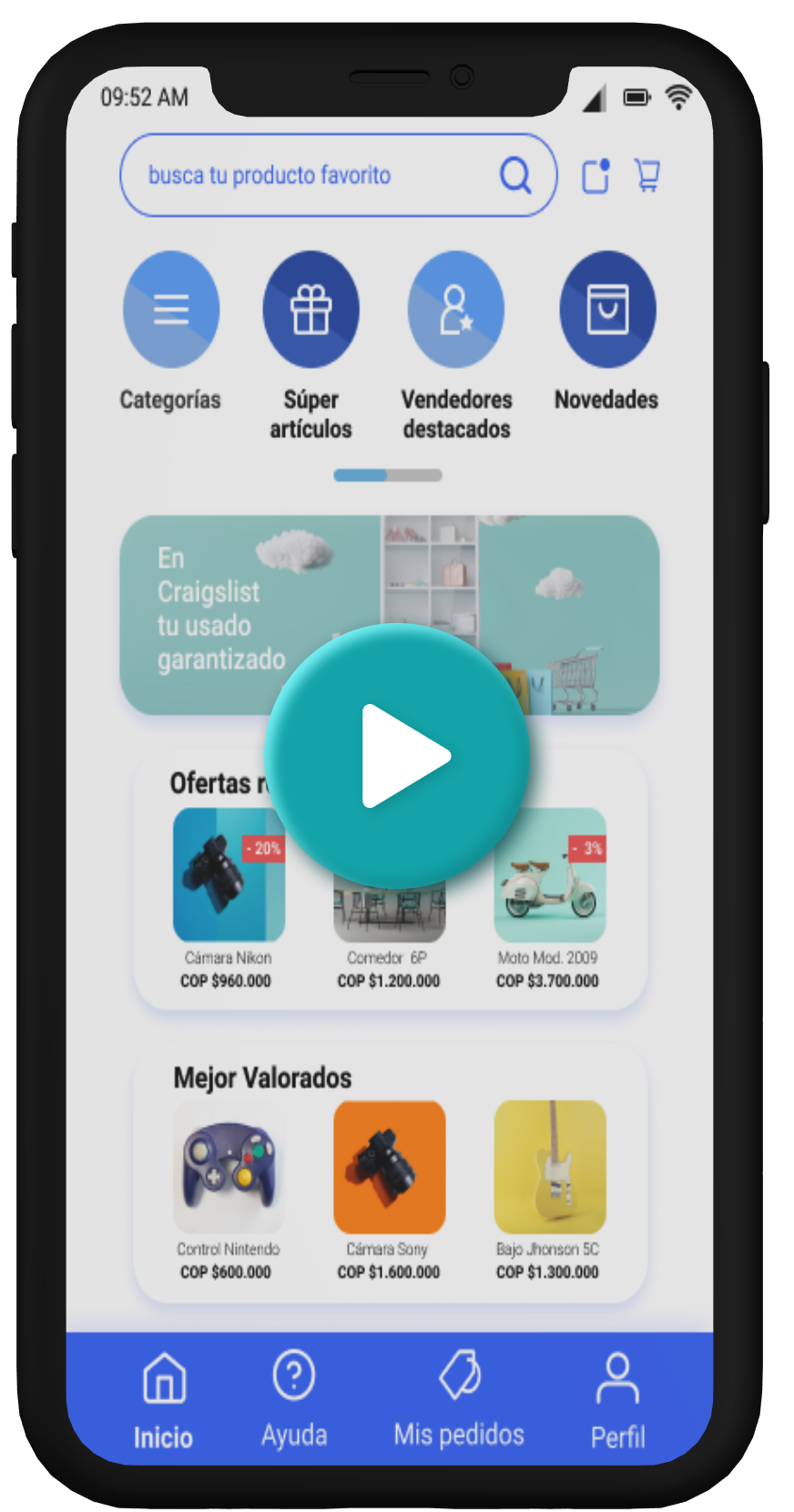
And finally, designed the high-fidelity prototype. You can see the video on the right side.
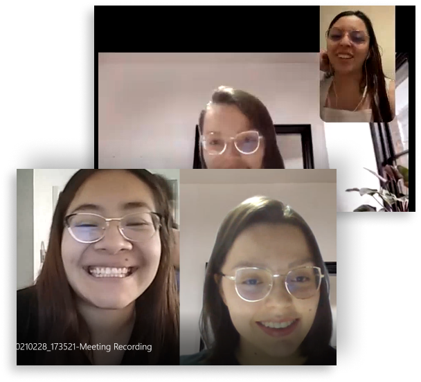
To make the needed iterations, we made a UX testing with 6 people.
We made a short interview at first. Then, we put a context so they could make the task, and in the end, we talked about all the experience with the prototype.
We had great reviews, during the test they didn’t do a lot of mistakes and completed the task. But, we determined some points of improvement.
After all, we can say that we achieved the goal of the project:
Redesign Craigslist according to the user's needs.
- We solved the problem of distrust that users had by unifying the multimedia in the app.
- We made the communication accessible by putting contact buttons on strategic screens.
-We made a modern design that is more appealing to users.
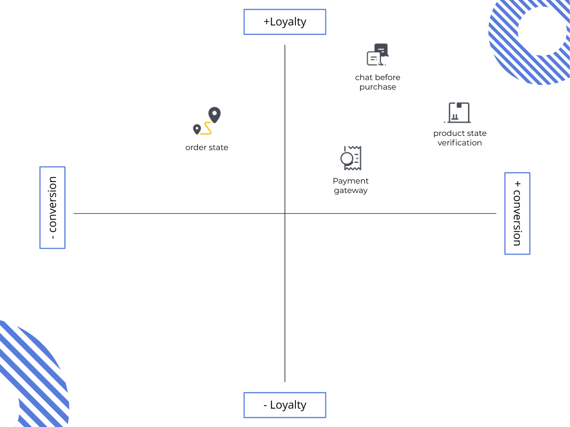
We took the four most important points of improvement and put them in a graphic to see the impact on the company.
Then, we noticed that the urgent tasks we have to work on in-depth are:
- The product state verification.
- The chat because affects the conversion rate and is the added value of the app.
After that, we have to work on the order state since it’s an important task, but it doesn’t affect as much as the others.
Finally, we should talk with the company to put a bigger payment gateway, because it is an expensive tool.
Do you have a project in mind? Do you have any feedback? You can contact me at any time, I will reply to you in 3 - 6 hours.